
Role
Senior UX Designer
Area
B2C digital products
Embedded UX
Concept development
Year
2025
Team
A PM, two software engineers and a visual designer
reMarkable:
Evolving system navigation for deep focus
Key impacts
- Reduced users' time to reach their content by 30%
- Defined the 'Time-to-content' roadmap
- Owned the end-to-end design of the core homescreen features for the launch
- Cleaned up thumbnail code so the UI adapts to different screen sizes, including Paper Pro Move
the challenge
Reducing time to find the content to protect user focus
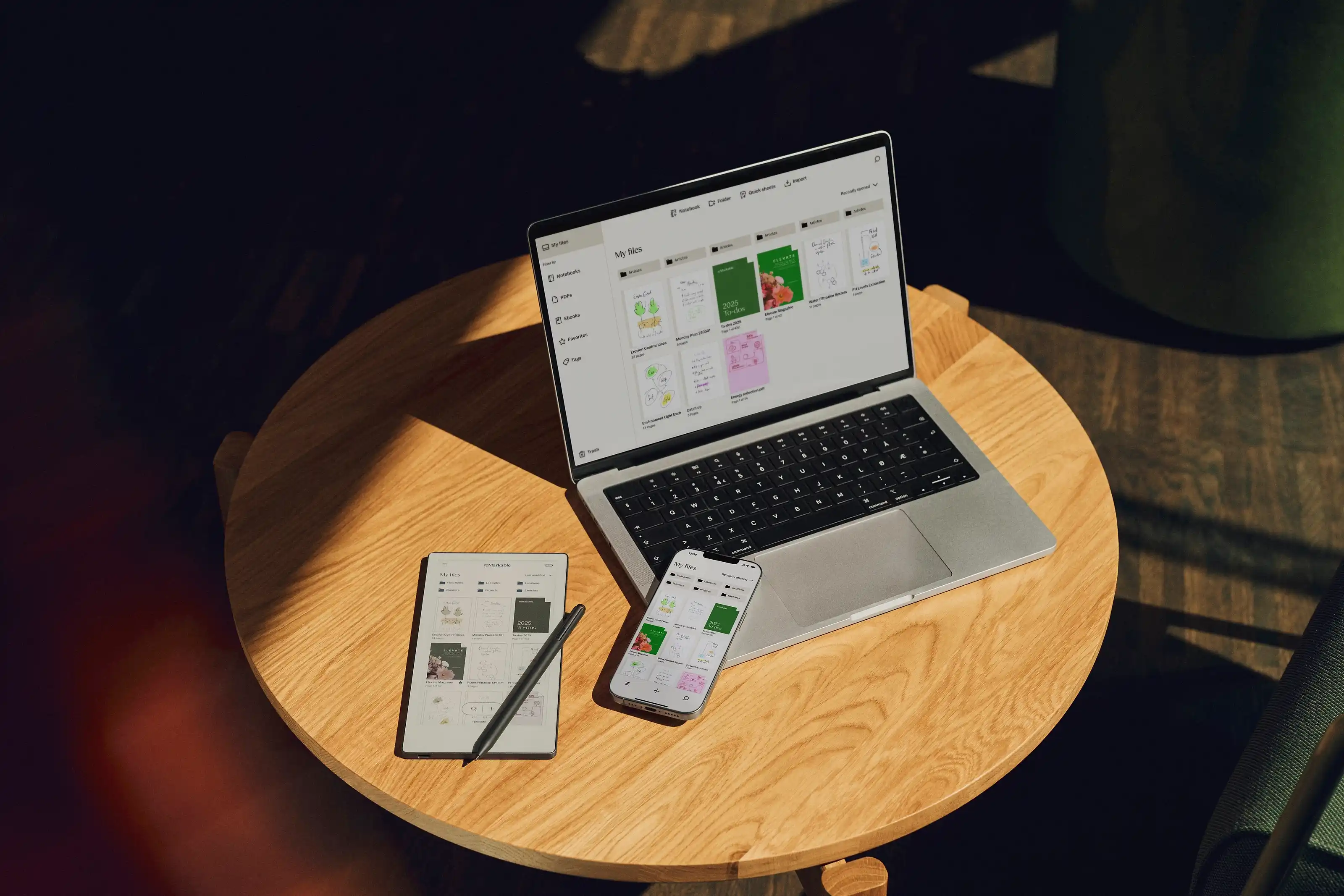
The data showed that as users’ libraries grew, it became harder for them to find their active work. Our goal was to reduce the time it takes to find an existing note so users can stay in the flow. We had to balance this new paradigm with our 'My files' experience, ensuring the interface didn't feel cluttered for new users while providing power users with the high-density navigation they requested.
the goals
Creating a scalable system for long-term user growth
My goal was to evolve the navigation from a static folder structure into a dynamic system that adapts to user workflows. I defined four strategic pillars to guide this evolution:
- Optimising ‘Time-to-Content’. Reducing the steps and cognitive load required to return to active work, ensuring users stay in the flow.
- Balancing discovery and focus. Introducing modern tools, like enhanced search and recent activity, without interrupting the ‘deep work’ experience unique to reMarkable.
- Architecting for scalability. Designing a flexible UI framework, including a more capable navigation drawer and smart grids, to support future features without cluttering the screen.
- Data-informed prioritisation. Using beta feedback and user behaviour data to identify and solve the most impactful pain points first.
the PROCESS
Testing, building, and refining
To get this right, I followed a clear path from start to finish:
- Concept exploration. I began by exploring various UI paradigms for document handling that were scalable. I focused on keeping the most important tools easy to find and hiding the complexity until they were needed.
- User testing. I conducted in-person testing with 12 users on multiple grid layout variations. This was vital in finding the ideal balance between thumbnail density and intuitive interaction.
- Collaboration with engineers. Rather than just handing over designs, I worked closely with software engineers to refactor code and reduce technical debt. We ensured the new responsive logic was robust enough to support different screen sizes for future products.
- Beta feedback loop. I synthesised feedback from beta user surveys to validate our changes. These insights were instrumental in defining and prioritising refinements for the subsequent software release.
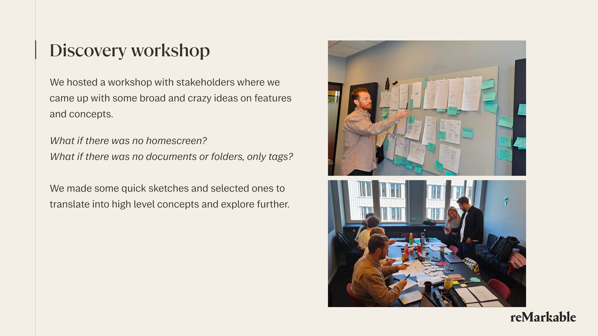
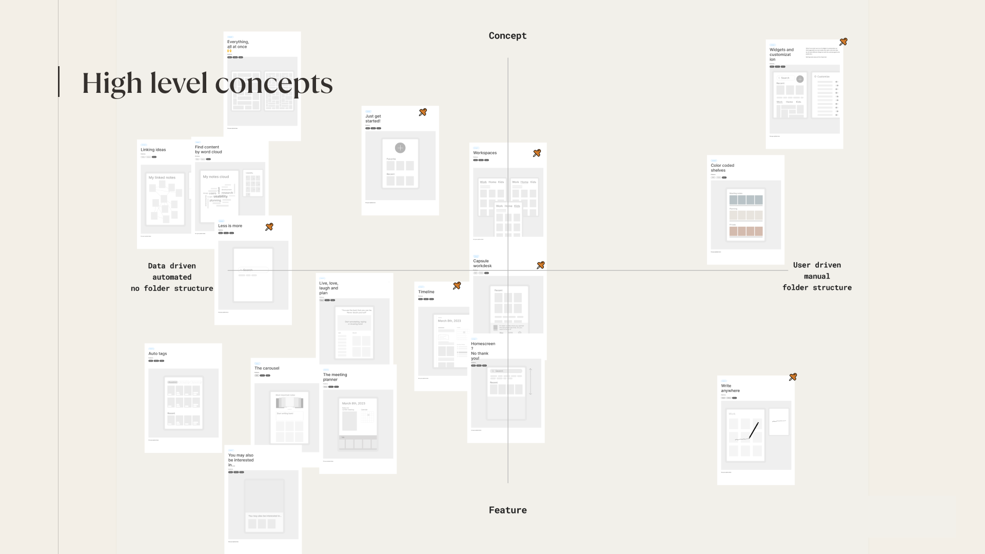
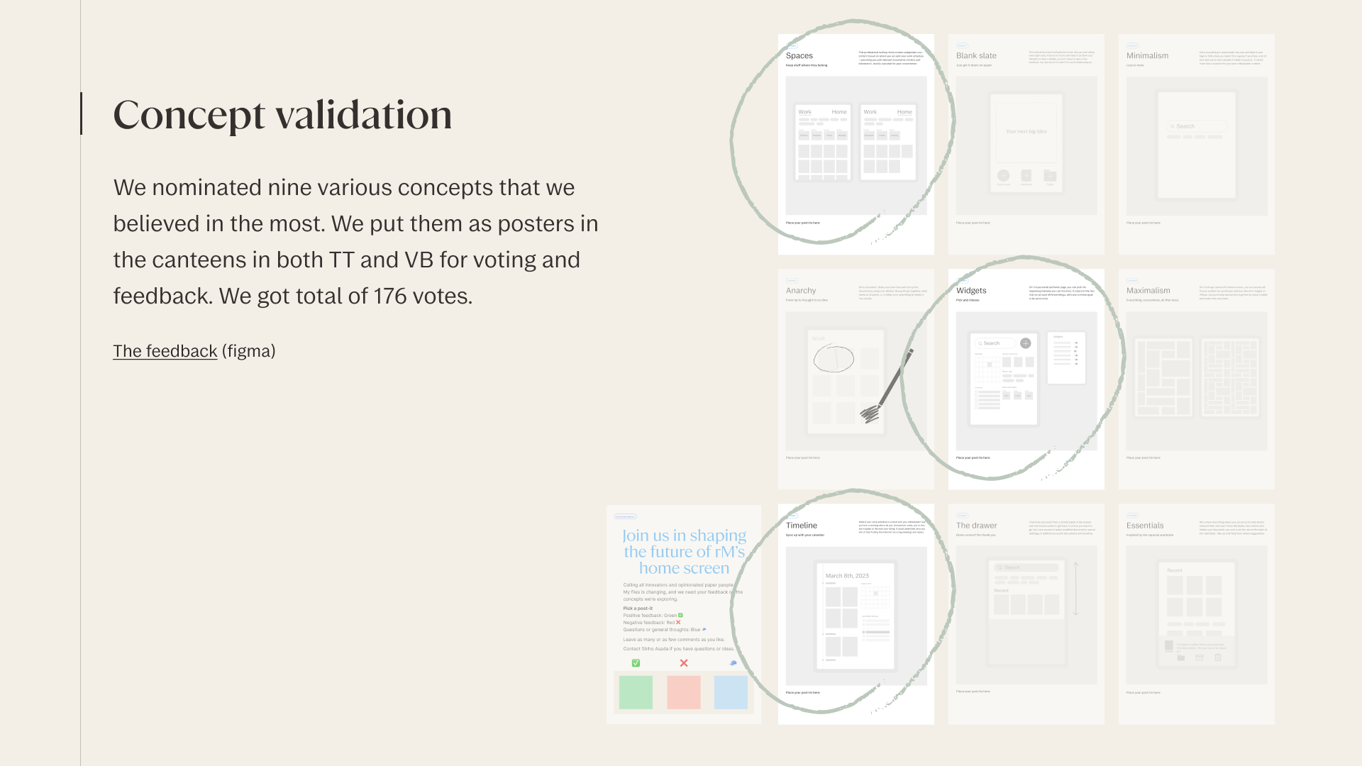
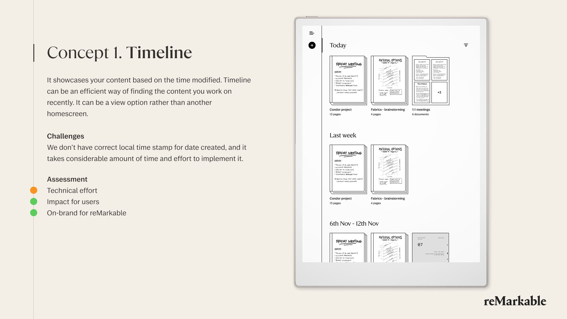
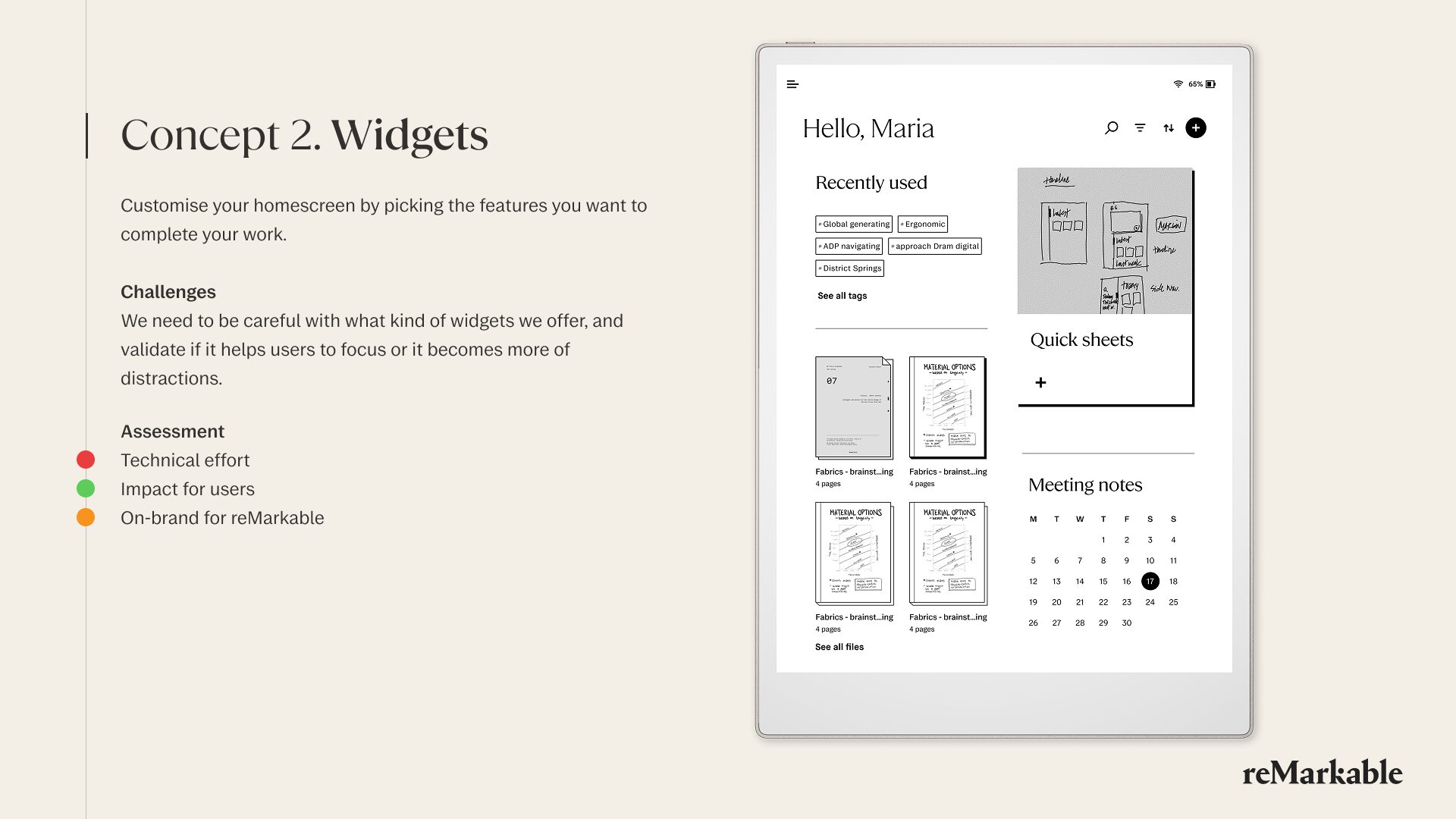
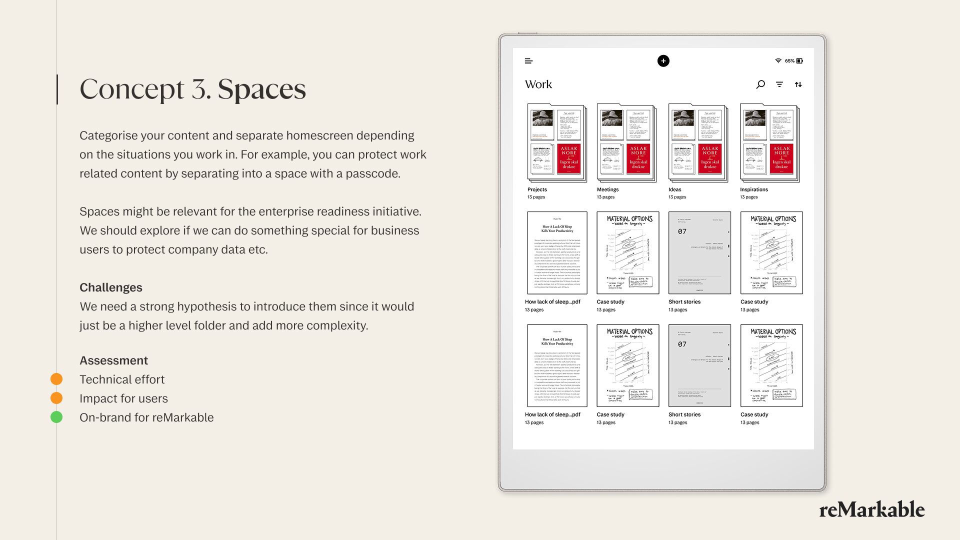
*Due to the confidentiality, only released updates are shown below
The outcome
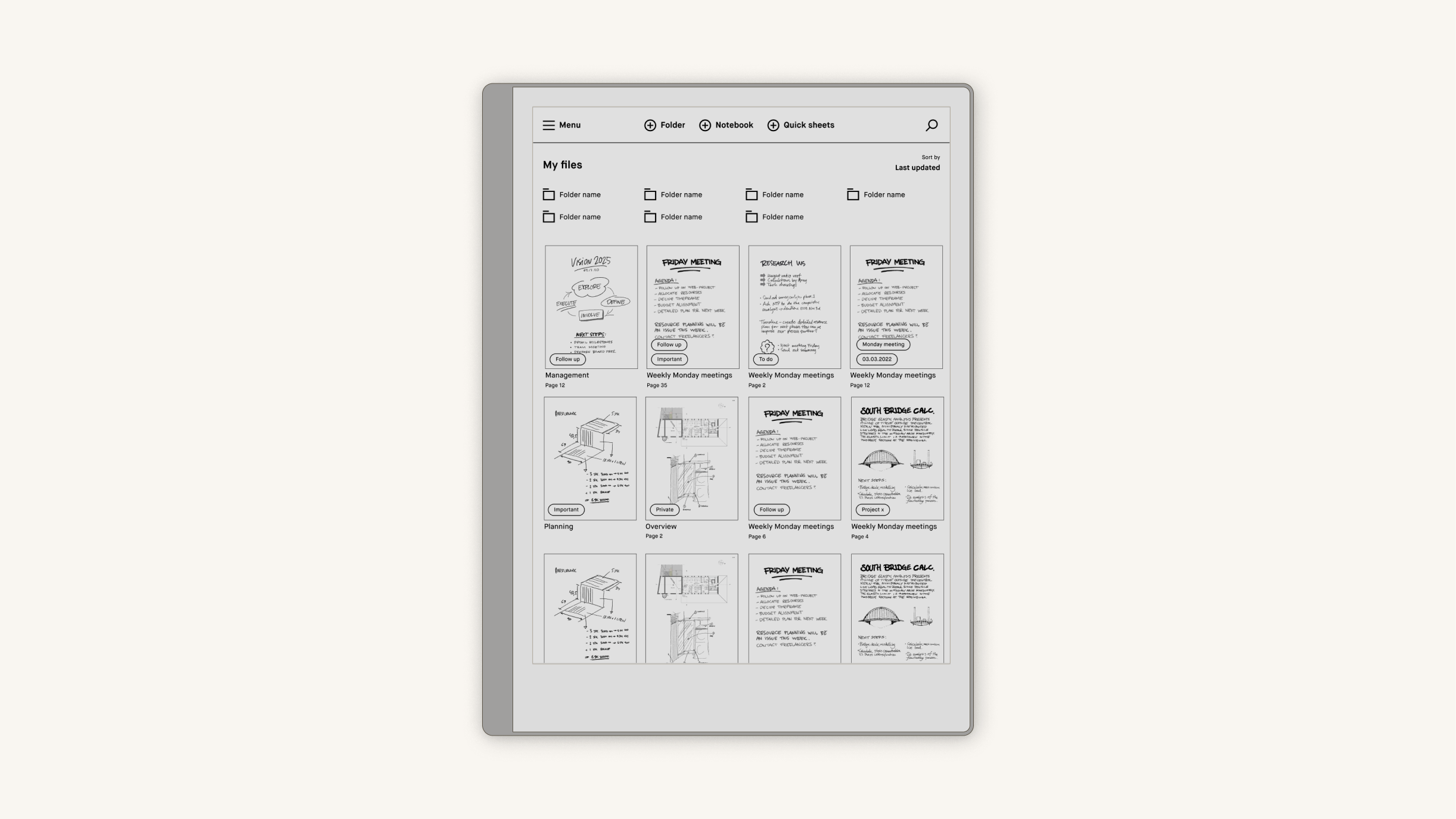
The decluttered library
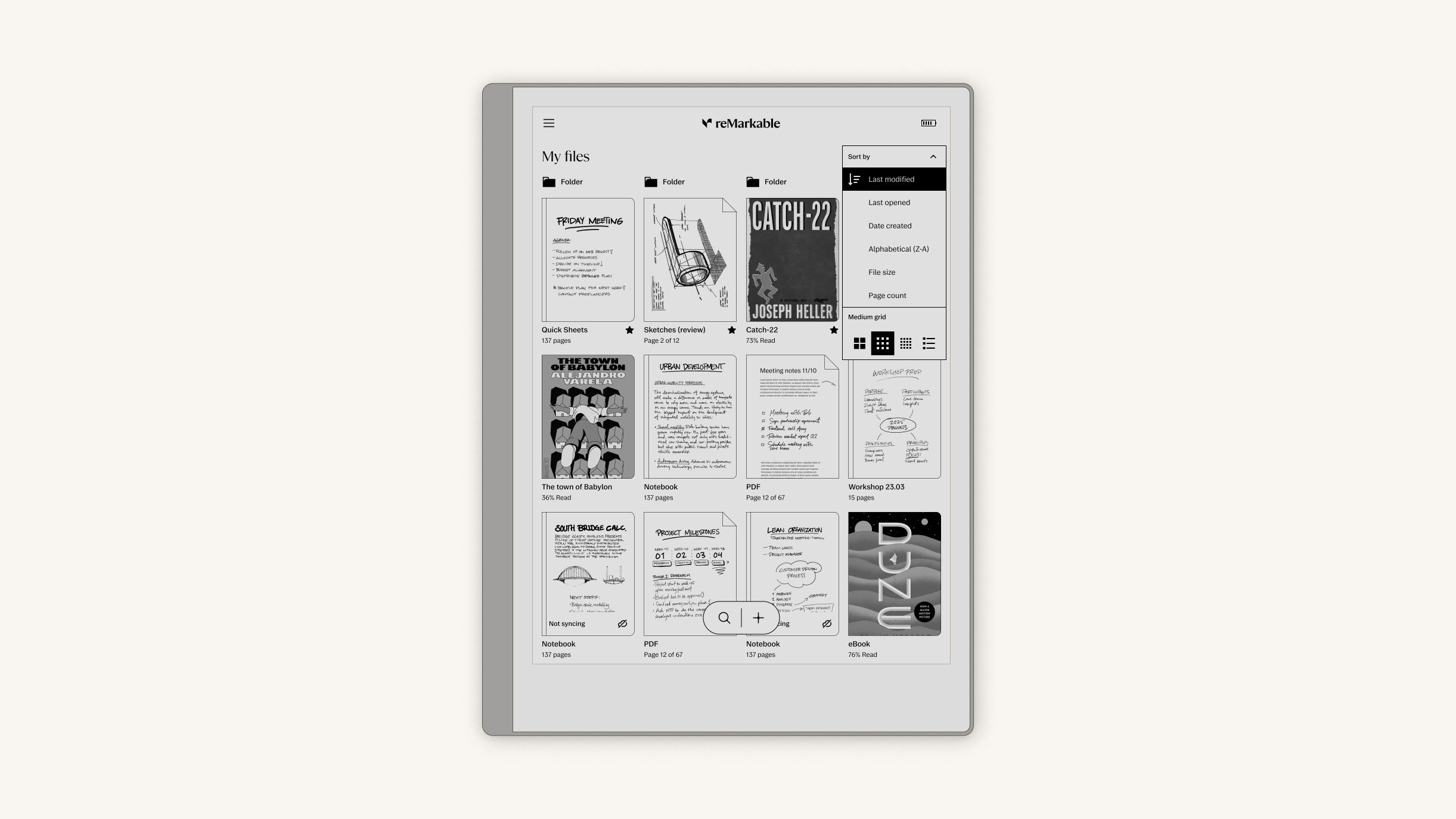
The homescreen got a new look for the new product line, Paper Pro series. The added detail for the content cover jackets, the creative shortcut, and the dropdown for the sorting and viewing options help the users their content at a glance.
Dynamic thumbnails
I collaborated directly with software engineers to optimize the codebase for responsive rendering. Before this improvement, the size of the thumbnails were manually coded for screen sizes. I ensured the code debt was cleaned and more adaptive to various screen sizes. It was especially crucial for the release of Paper Pro Move, which is hand-sized. We also tested the latency thoroughly to ensure smooth visual feedback.
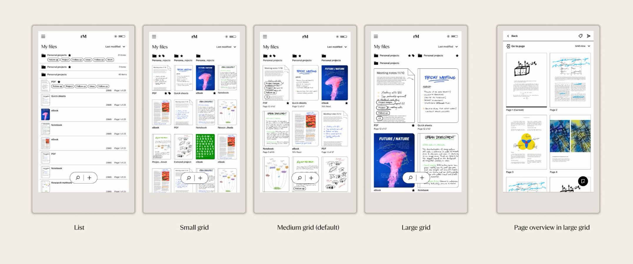
Different grid sizes for Paper Pro Move
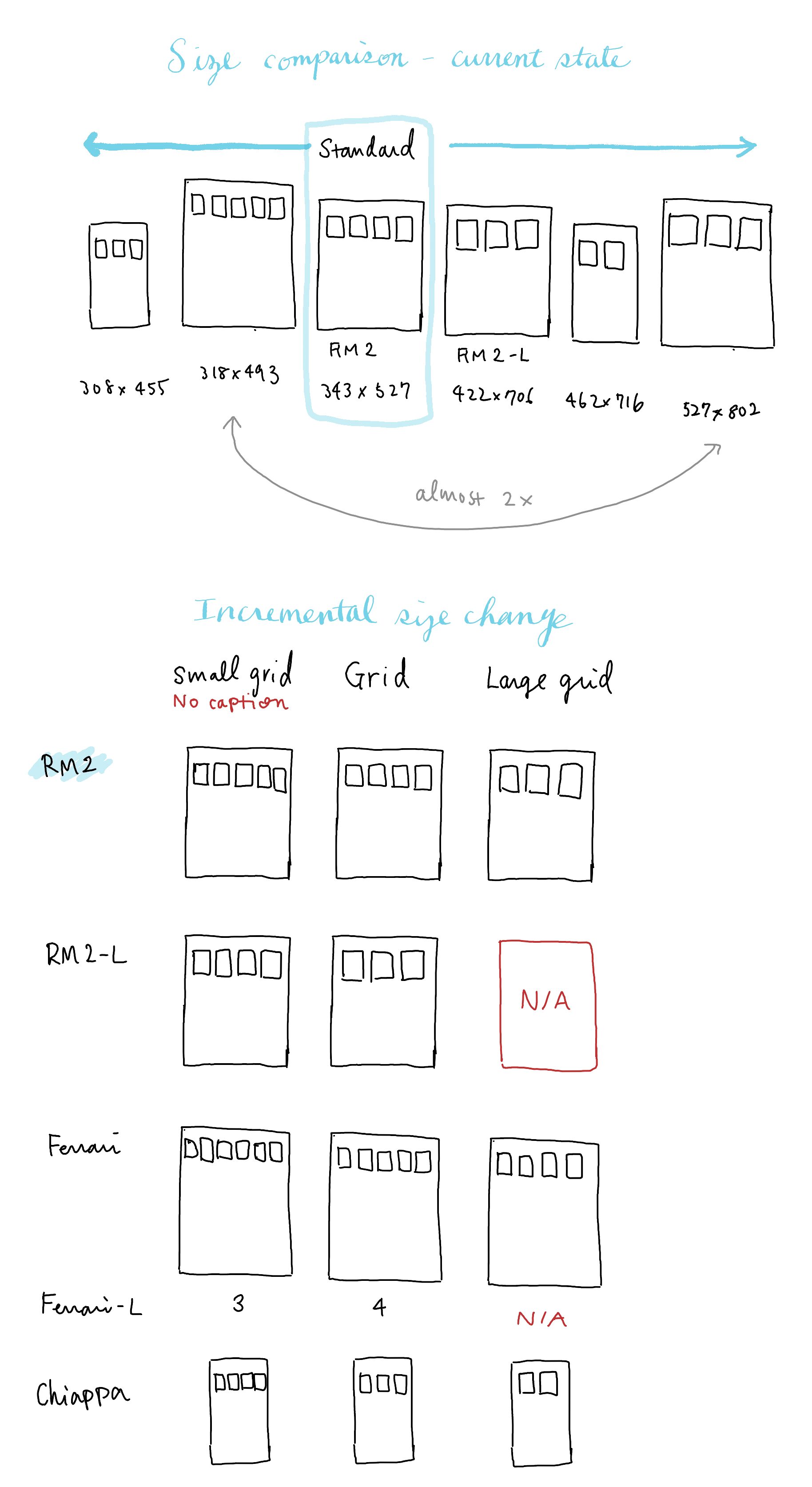
An initial sketch to define the logic
Result
Positive impact on the users' efficiency and the product's improvement
Faster return to work
Telemetry showed the time to reach existing content dropped by ~30%. In moderated testing, most of the participants found a requested document faster with the new homescreen than with the old version.
User sentiment
Beta feedback showed that the users found it became easier to find their desired documents. ~90% of the beta users responed positive to the change.
Strategic alignment
The multi-phase navigation roadmap I defined was approved by the CTO and now guides future OS releases.
Brand integration
The new homescreen was featured in the Paper Pro launch marketing.
Get in touch if you're interested in working together, or want to grab a coffee!
© 2026 Shiho Asada
