
Role
UX/UI Designer
area
B2C digital products
Embedded UX
Data visualisation
Year
2018
Team
Jan Perhac | Software development
Simon Schubiger | Software development
Singapore Views
Singapore Views is a software for making interactive presentations using multiple geo-data of Singapore and multimedia elements (pictures, videos, and 3D models) for researchers and designers in urban planning. The presentations made with Singapore Views helped the audience understand the context better and give a more immersive and dynamic experience than static presentations. I developed the concept and designed the UX/UI for the initial prototypes.
data
Urban Heat Island Effect | Singapore-ETH Centre
Green Buildings | Future Cities Laboratory
challenge
Developing a visually oriented presentation tool for megapixel displays
The project started by thinking about utilising a large videowall at Future Cities Laboratory, a Singapore-based Swiss research institution that focuses on urban design. The video wall consists of 16 units of 55" displays in a 4×4 grid, resulting in a 33-megapixel display. It's approximately 4.9m wide and 2.7m high. Even though it's a pretty high-spec display, it had until then been used only for standard slide presentations.
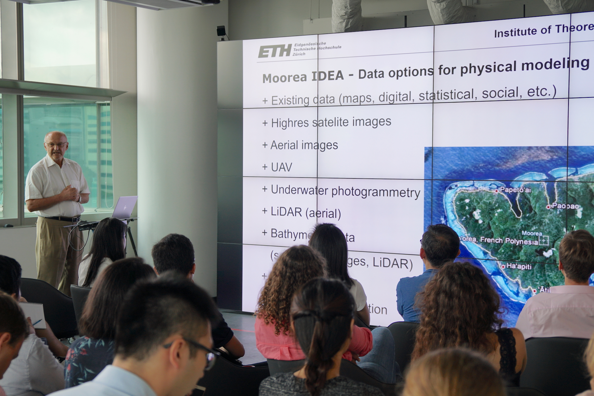
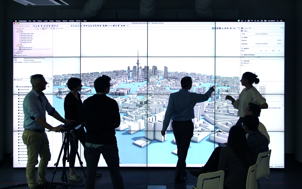
The previous uses of the video wall: The first picture was with PowerPoint, the second one was with ArcGIS CityEngine. The displays frames distracted the presentations.
Designing with multiple data and media
The most challenging part was figuring out how to visualise multiple geo-data and show multimedia content simultaneously. The datasets are, for example:
- Singapore Master Plan 2014
- Temperature data of the urban heat island effect in Singapore
- Locations of selected green buildings in Singapore
Multimedia content includes:
- 3D models of buildings
- Pictures
- Videos
goals & users
Integrating multiple data for urban designers and researchers
The followings are the goals of the project:
- Creating a user-friendly and visually oriented presentation tool for researchers and designers in urban planning
- Integrating several geo-data and multimedia content in one application to fully showcase research outcomes
- Giving the audience a clear understanding of city design and urban research in Singapore
- Providing a seamless and immersive presentation experience to the audience.
The target users of Singapore Views are mainly researchers and designers working on urban planning, big data and civil engineering. The user persona was made based on the interviews with the researchers and designers working at Future Cities Laboratory.
DESIGN PROCESS
Two modes of the product
I defined the two modes:
- Presentation mode — When a user gives a presentation with the tool
- Edit mode — When a user creates his/her presentation with the tool
I started by designing UX/UI for the Presentation mode, then continued with the Edit mode.
PHASE 1, PRESENTATION MODE
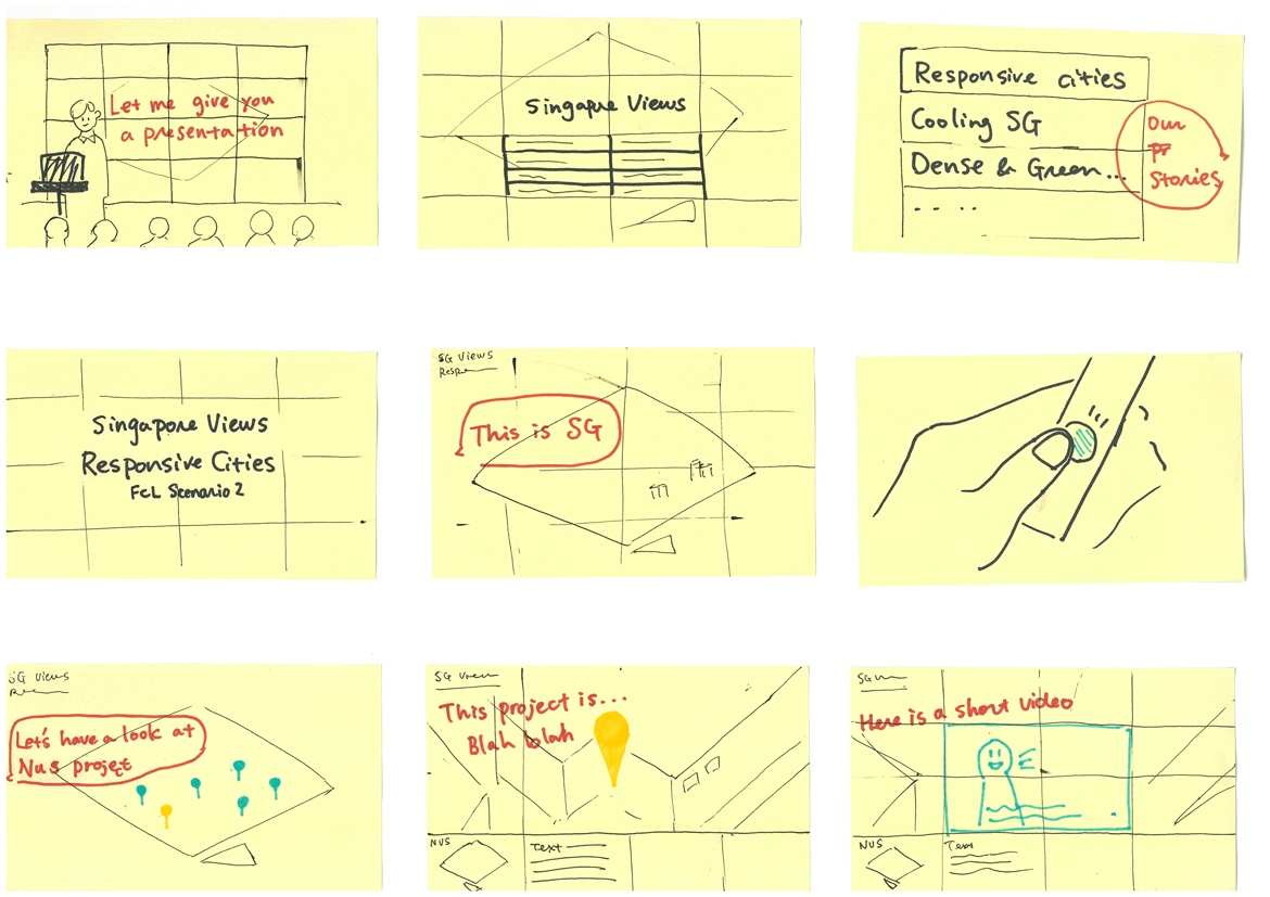
Storyboarding
I kicked off with storyboarding, and shared with the team to discuss how the interactions should be in the real context for presenting the data.
visual design
Clean UI to showcase complex datasets
The challenge here was to design a clean Ui with complex datasets and elements, such as 3D map, climate data or traffic data. I carefully designed with a clear hierarchy of information and accessibility-friendly colour pallet.
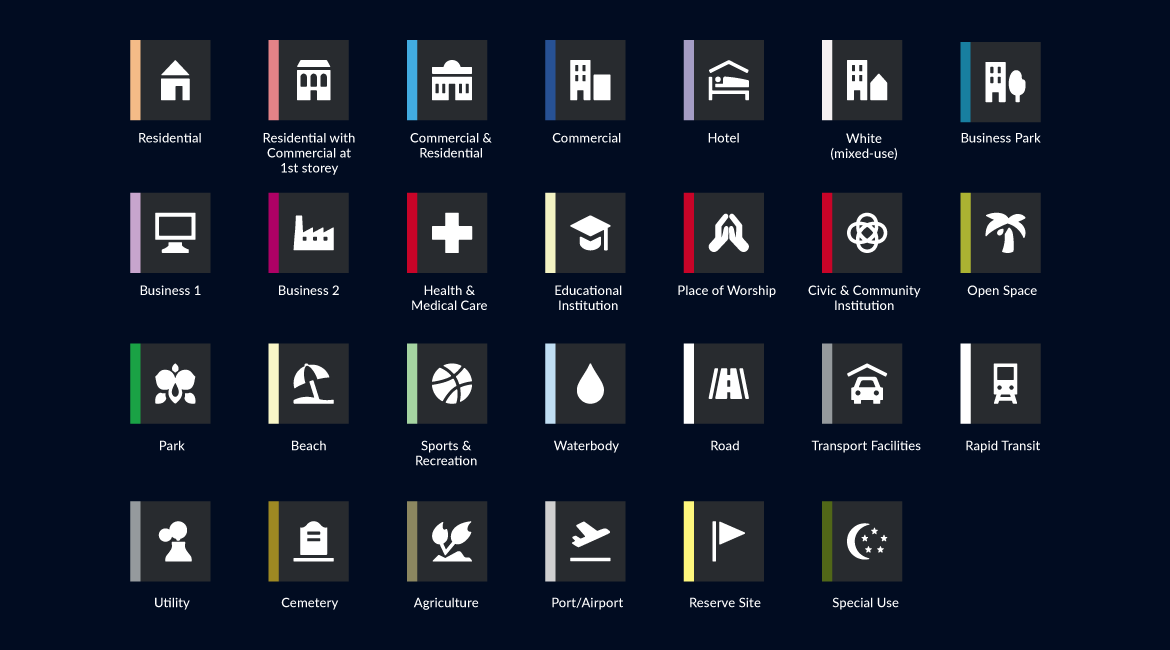
I also designed 18 icons for the Singapore Master Plan. Those icons were designed to work both in browsers and the presentation display.
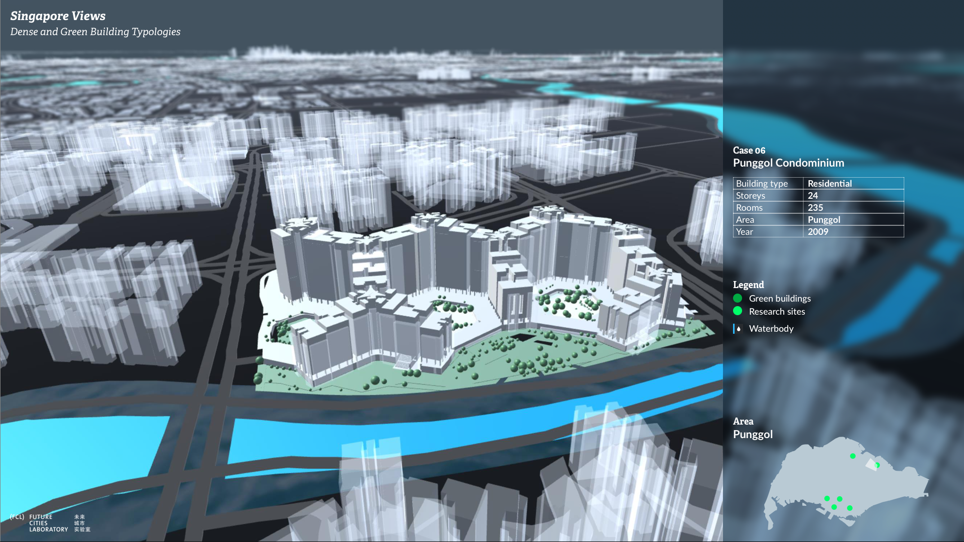
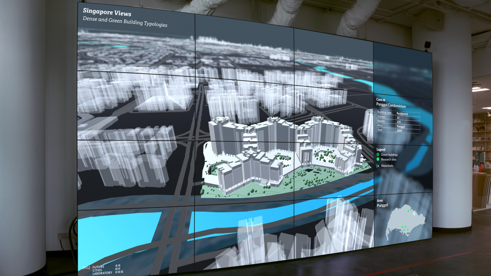
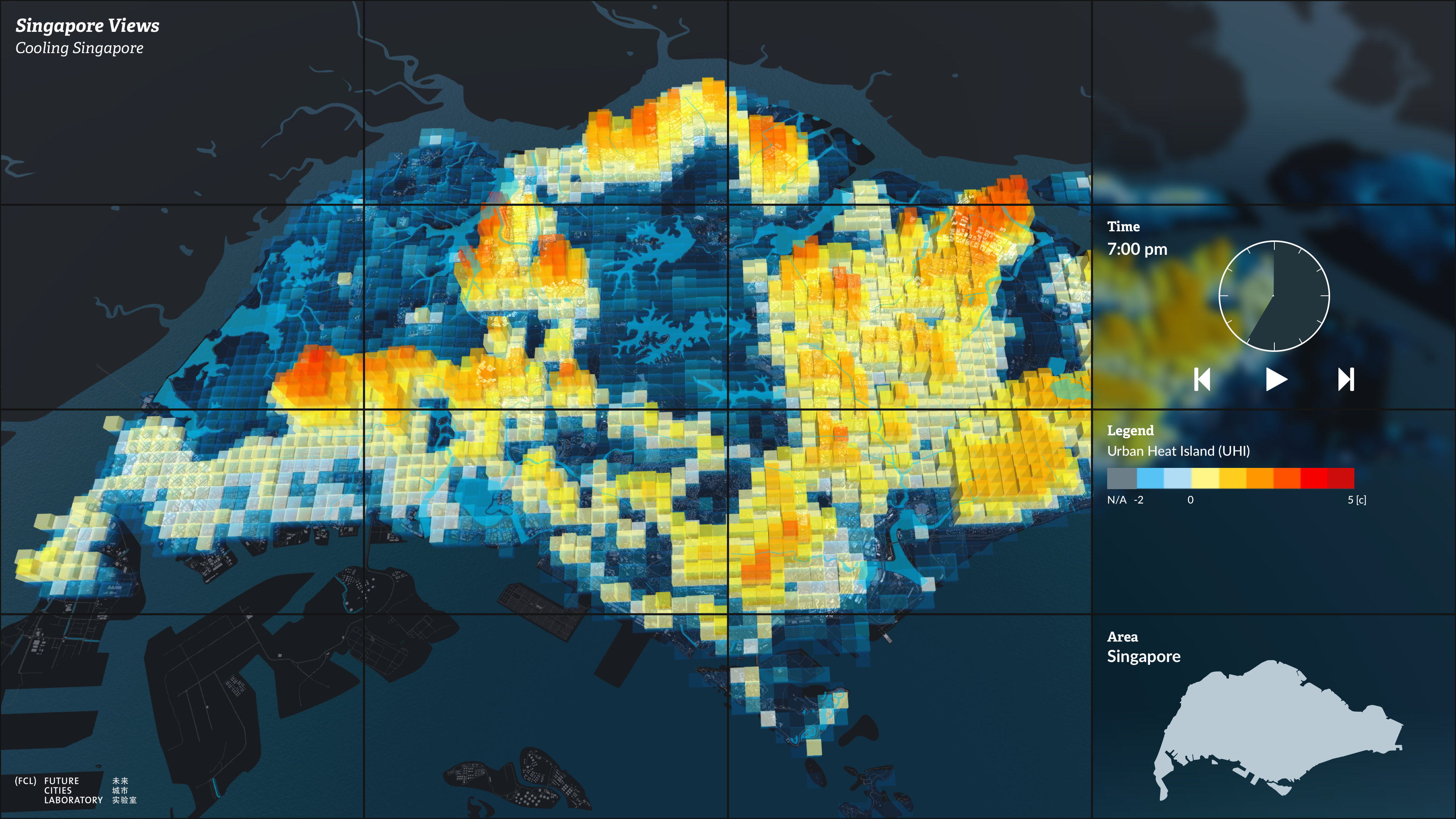
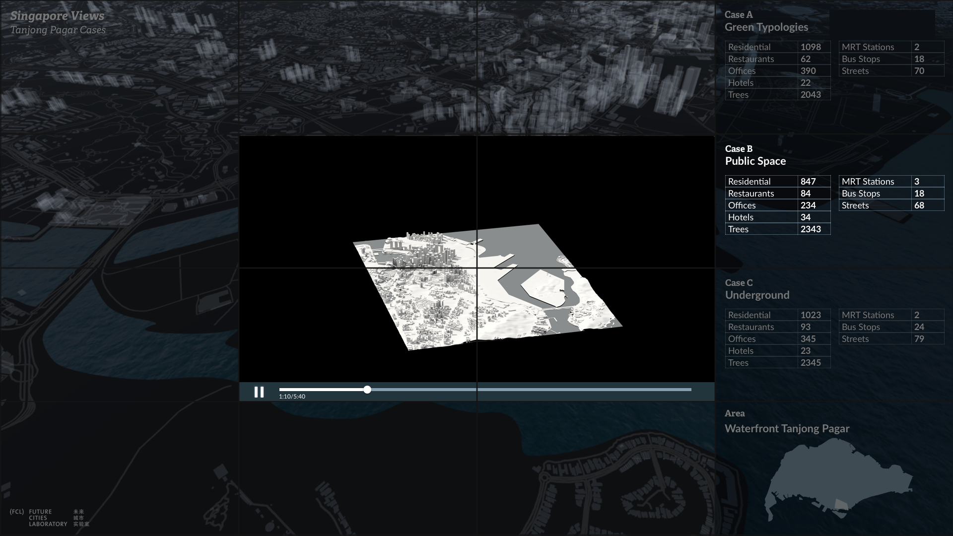
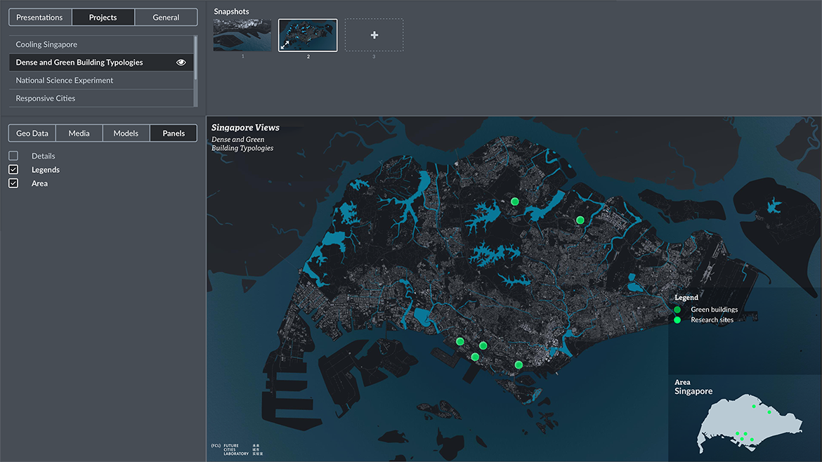
The UI panels show detailed information of the model, legend, time slider and/or an overall map of Singapore, depending on the 3D map views.
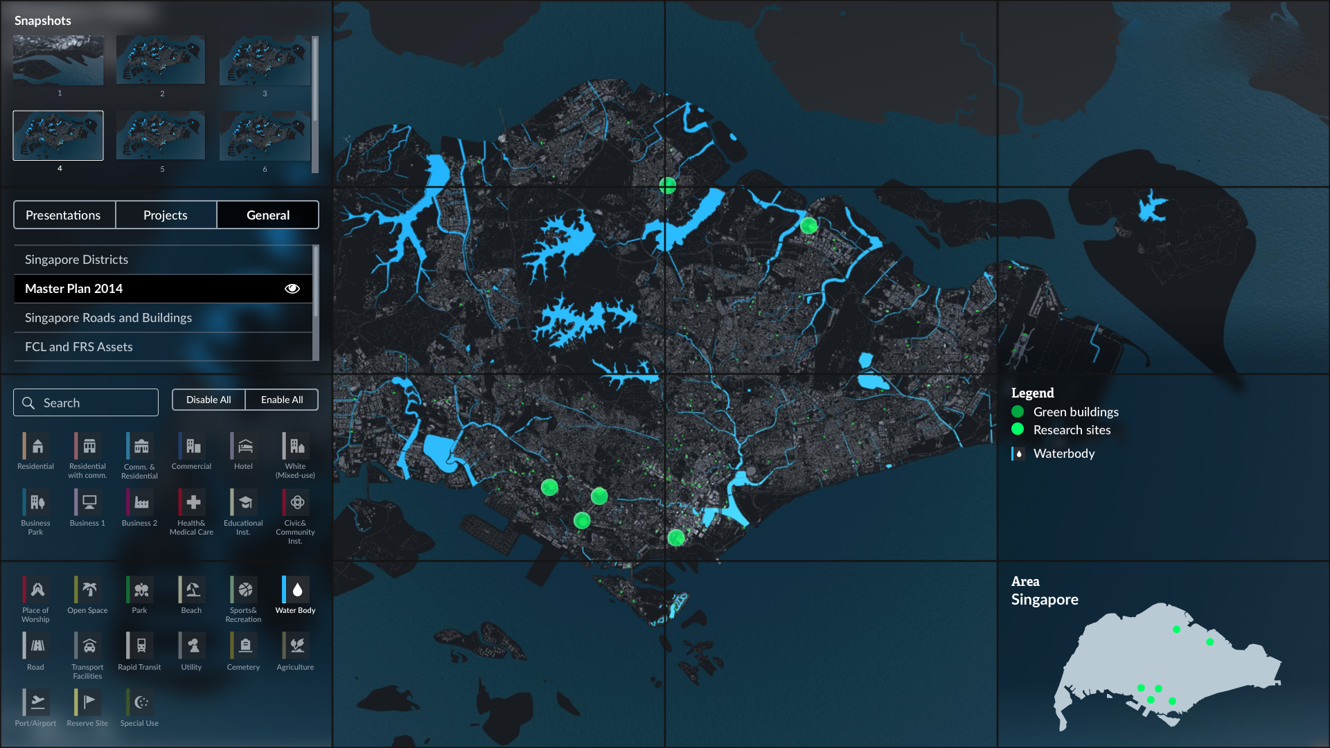
While giving a presentation, a presenter can review previous snapshots and layers from the hidden UI panels on the left side. The panels can be pulled out when the mouse goes to the top-left corner.
PHASE 2, EDIT MODE
Defining the functions
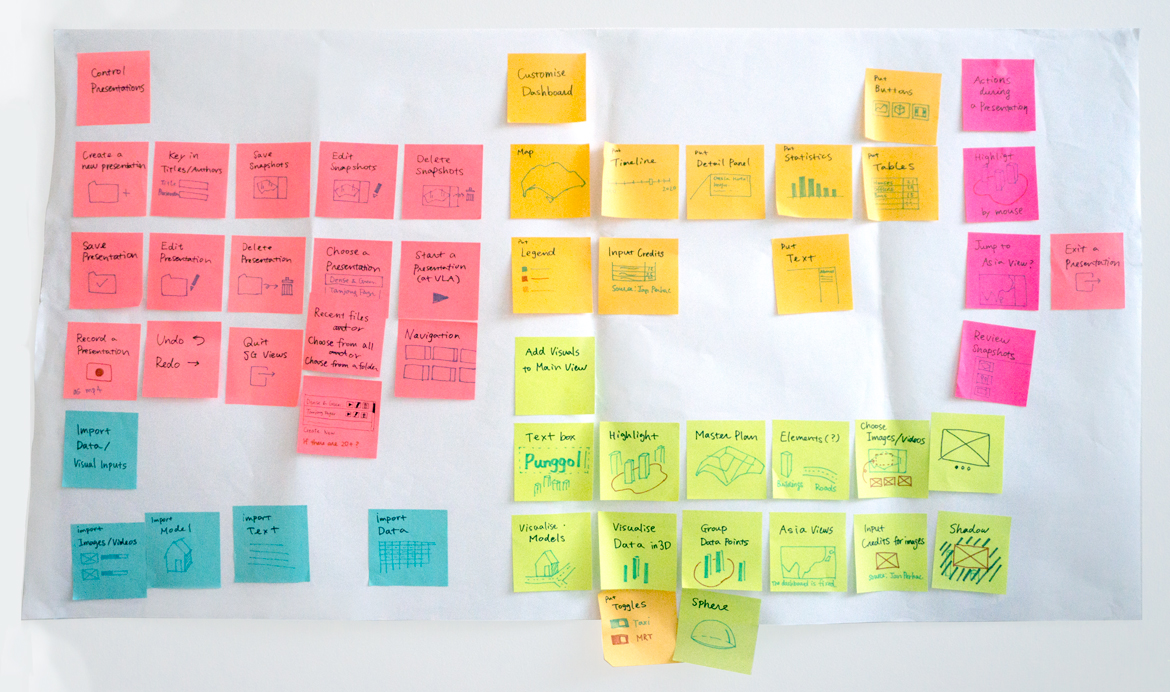
We defined the functions for the Edit mode and grouped them into 5 categories based on the users' actions which need to create presentations:
- Controlling presentations
- Importing data and visual input
- Customising the UI Panels
- Adding visualisation and multimedia contents to the 3D view
- Actions during presentations.
Based on those categories, I made a visual map by using illustrations and 5 colours.
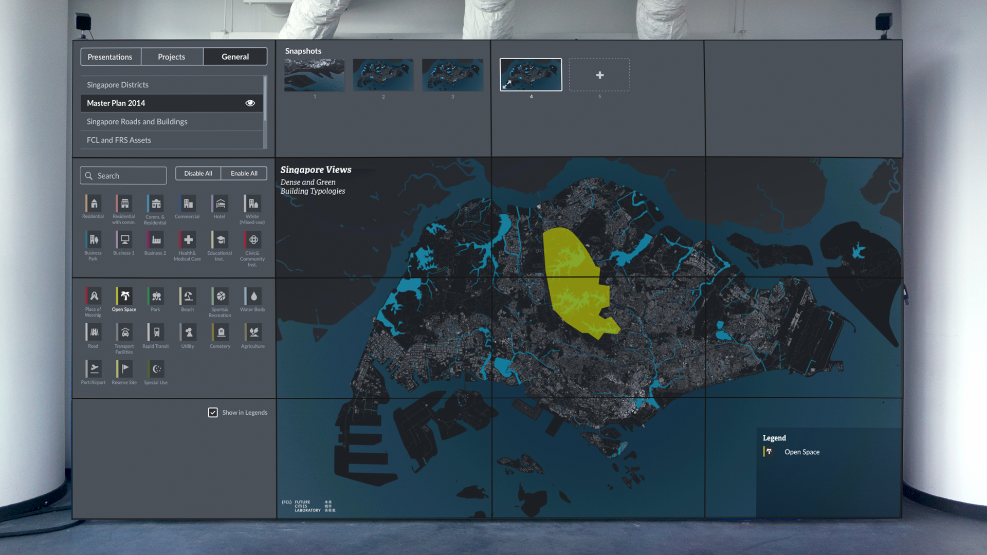
The UI that works both on desktop and the diplay
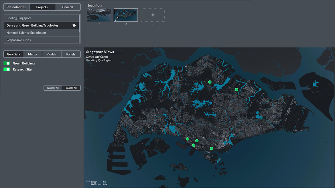
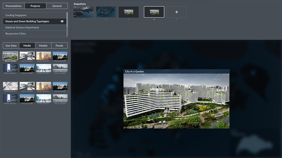
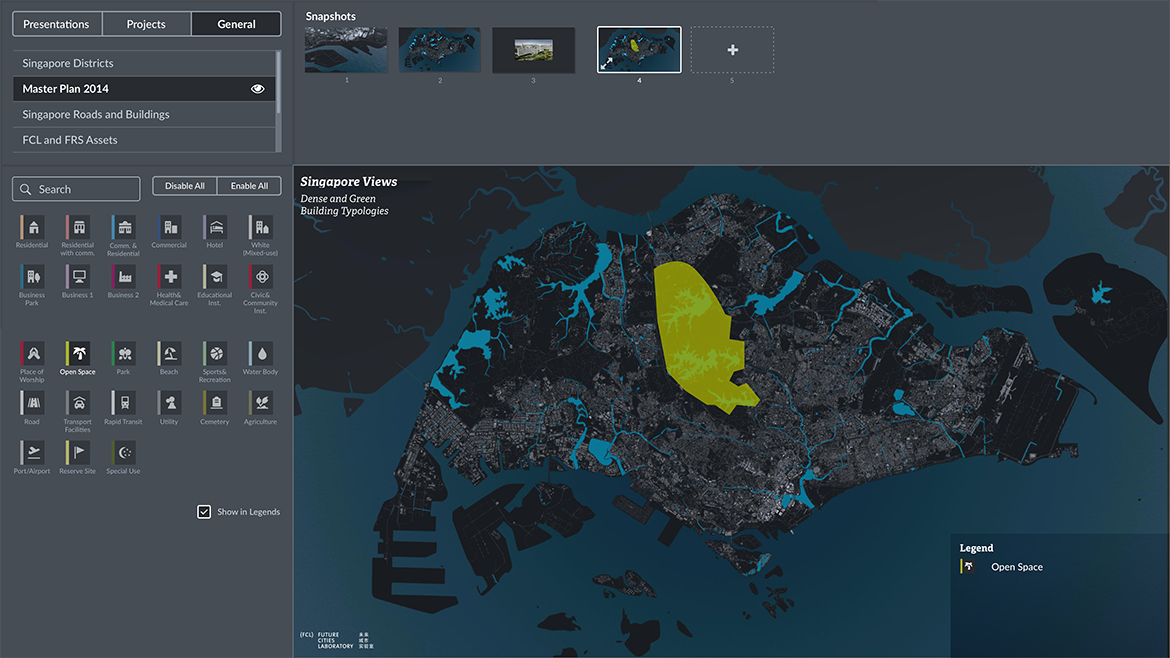
The final UI was designed to be funcational both on the large diplay and desktops. While catering many features, each of the panel has a clear role to make a presentation.
The left panel consists of:
- Presentations—Viewing the existing presentations and creating new ones
- Projects—Data and multimedia content related to each project
- General—Data and multimedia content related to Singapore data (Master Plan, infrastructures etc.)
interaction
Interactive prototype
impact
Supporting urban overheating in Singapore
Cooling Singapore, an academic and government initiative tackling urban overheating, used Singapore Views to present its climate simulations and large-scale district cooling networks. After my involvement, the tool continued to be developed and was used in further projects with different datasets.
The tool and its design process were also published as an academic paper, which I presented at the 22nd International Conference on Information Visualisation in Italy, 2018.
Get in touch if you're interested in working together, or want to grab a coffee!
© 2026 Shiho Asada
